I’ve consolidated hours of watching and listening to YouTubers interested in money and like the information found on their respective channels. I believe these graphics are worth several minutes of paragraphs of reading, and my help in getting a snapshot of where we are with Jerome and Janet going up the hill to fetch a pail of fiat.

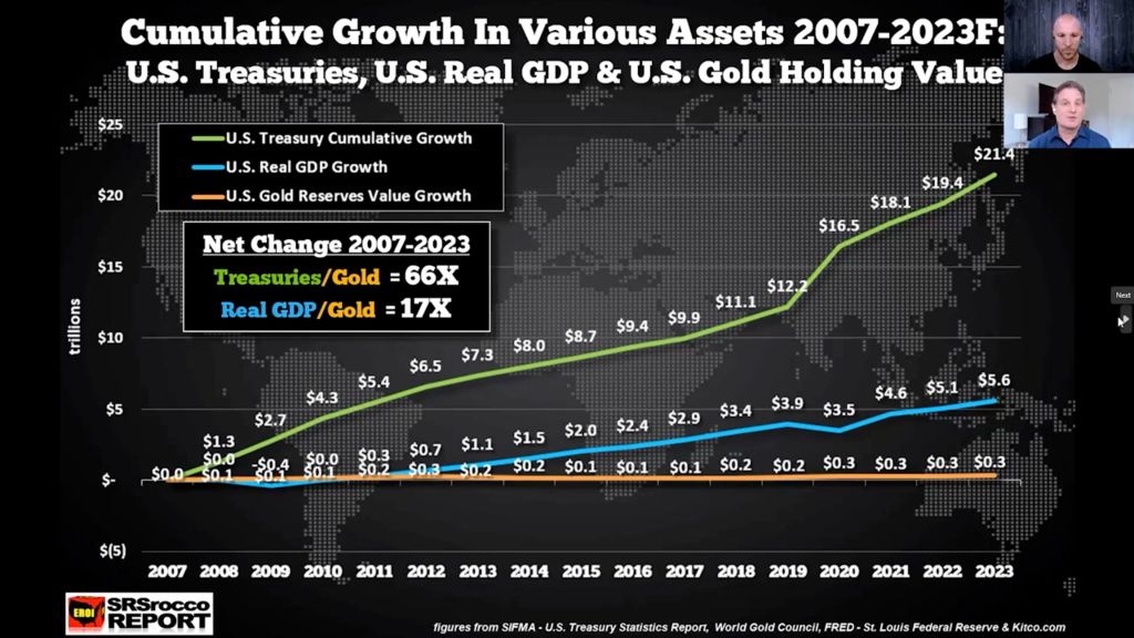
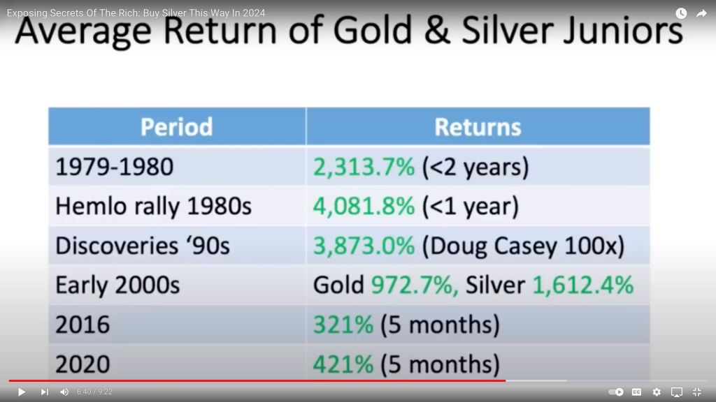
Above we see the dramatic lag of Net Asset Value of Gold in general, and also the decline in value of Senior Gold Miners and Junior Miners: GDP and Treasuries have clearly been the choice for returns rather than holding positions in the precious metals. But lately, that has been changing. In fact, the next few graphs show what has happened in our past when Silver and Gold have increased dramatically. All this talk of “soft landing,” “hard landing,” “melt-up,” and “blow-off top” can be simply shown below in graphic form.
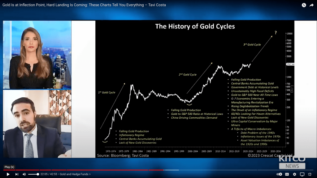
Here we see the past two gold cycles as two major staircases higher. Looks like we’re due for the next up the down staircase.


If you love to enter contests, look what I found!

Happy Stacking!
